
Responsive design
April 2, 2020
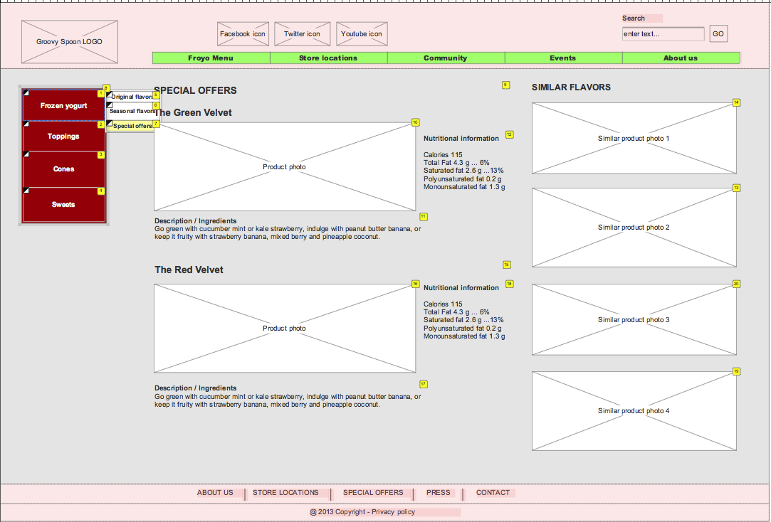
GROOVY SPOON: Froyo Menu Page
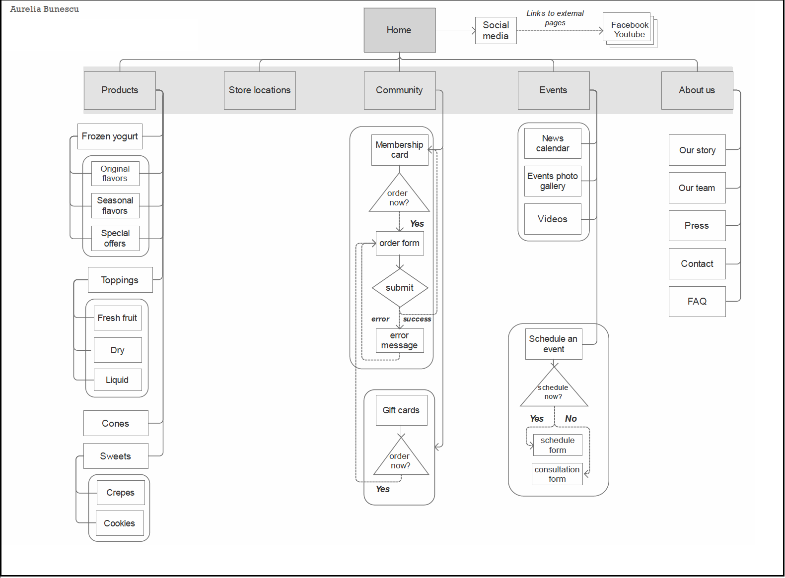
For this project I have provided a complete responsive redesign proposal that included personas, site architecture, wireframes and user flow, and design layouts, using Axure as a main tool. The user-testing method that I have used was card-sorting. Its results revealed that there are several categories of target users for this type of website (children & teenagers, parents, and contractors), fact that was helpful in restructuring the site and designing wireframes for desktop, tablet, and mobile. (Project completed in 2014.)
SITE DIAGRAM & USER FLOW
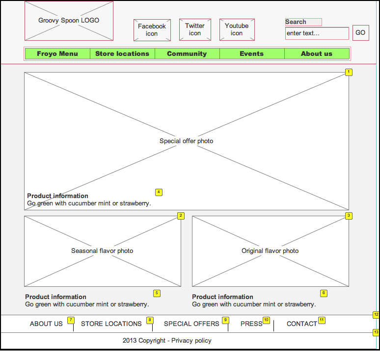
WIREFRAMES & ANNOTATIONS: Desktop version (Special Offers Page)
 –––
–––
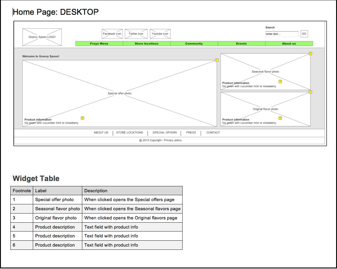
Desktop version (Homepage)
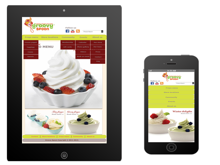
Tablet version (Homepage)
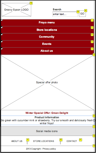
Mobile version (Homepage)
© 2024 AureliaB | Theme by Eleven Themes